Have you ever felt like every time you mastered a new design technique, there’s something else new and exciting that you see on websites? I know how you feel.
There will always be new design trends we’ll hear about regularly and learn from. Some of these trends are long-lasting ones, though. These are ones that you, as a marketer, should be aware of when creating new webpages or beginning a website redesign.
trend #1: responsive design
Responsive design is one of the latest trends in website design — and it’s becoming a must have as of late.
When a website is responsive, it means that the layout of your webpage will adjust to whatever screen size on which you’re viewing it. This flexibility allows for a better user experience to get around a website, whether you are on a smartphone, tablet, or desktop.
Idahoan Food’s website is an example of a business utilizing responsive web design. See how the company’s content and images appear in different formats.

why is it cool?
Not only does Google love responsive design, but responsive design makes it easier for both designers and marketers to build and maintain one website.
As you build your website, you don’t have to worry about new mobile devices and tablets with different screen sizes being created because your design will adjust no matter what. You also don’t need to worry about someone on a desktop seeing an m.site instead of the desktop version.
Responsive design makes everyone’s lives easier: Those creating it have one site to worry about, and those viewing it will have a substantially better user experience.
trend #2: retina support
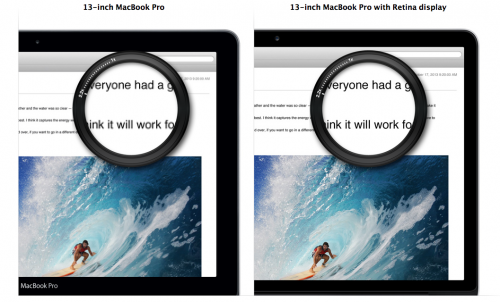
In 2010, Apple announced that the iPhone 4 would have a retina display. Many of us didn’t know what the tech giant was talking about, but regardless, designers rejoiced! We soon found out that the retina display meant that images on the screen would be much clearer than we’d ever seen before.
Think about it this way: You can see twice the number of pixels in a retina display than a regular display. That means designers can fit twice the number of pixels as before allowing them to create much more detailed pictures.
A bit of a disclaimer if you don’t have a retina device: Unless you’re viewing content on a retina device, you aren’t going to be able to see the magnitude of the difference between retina images versus non-retina images.
 why is it cool?
With twice as many pixels to work with as before, designers are able to put more detail into their designs. The retina displays ensure that the details of the designs are picked up much better than before. This opens up a ton of doors for website design and the opportunities that can be depicted through design.
trend #3: large photo backgrounds
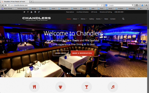
Have you ever gone to a website and been blown away by a stunning image that really takes your breath away? More and more businesses are putting large photographs as the backgrounds of their websites to really give the site visitors an idea of what the company is all about.
For instance, Chandlers Steakhouse, in Boise, Idaho, alternates between different photographs of its restaurant and their menu.

why is it cool?
The large photograph as a website’s background is a huge benefit for marketing. Visitors coming to the website instantly get a better idea of what your company is all about — whether that’s the culture or the exact purpose of the website.
In the image above, you immediately understand the ambiance and culture of the restaurant and can get a better idea about whether or not you want to go there. After all, you only have a few seconds to prove to your website visitor that they should stay on your page.
trend #4: infinite scrolling
You may recognize this technique when you are looking at Google Images. Infinite scrolling means that as you scroll down the page, the website continues to load.
Not only can you enjoy cute animal pictures on the website Cutest Paw, but the site uses this technique since it has many pictures that need to load at once.
why is it cool?
Simply put, infinite scrolling makes for a better user experience. To start, it allows users to remain on the same page instead of hopping between many different pages within your website. Also, it’s much faster to continue to load one long page than to load multiple pages.
Consider using infinite scrolling when there are a lot of images on your page so that you can give them a chance to load as your visitors scroll through your content.
trend #5: parallax scrolling
Parallax scrolling is a technique in computer graphics in which the background moves at a slower rate in the foreground, creating an illusion that looks like it is 3D.
Many websites have started to employ this technique, but if overused, it may look gimmicky. But if you consider how this technique will make your website more interactive with the audience, it can be very successful.
why is it cool?
Parallax scrolling brings websites to life. The images are still in 2D, but it gives an experience that makes it seem like 3D. It also helps marketers use websites to tell the story of what it is they’re marketing. As you scroll down, you find out more information about the product or service as images and text appear in different places.
This technique can be very powerful, as it can really bring your business to life for visitors.
trend #6: scalable vector graphics
Scalable vector graphics (SVGs) are an XML-based vector image format that allows designers to take their images to the next level with interactivity and animation. The video below shows what SVG files can do to take your graphics and animation to the next level.

why is it cool?
Because scalable vector graphics use vector images, you are able to resize them while avoiding any distortion of the image. They also work better when creating animations as we saw above.
HubSpot Graphic Designer Ivan Sunguroff says, “Scalable vector graphics are replacing bitmap imagery assets, as modern designers continue to optimize sites’ speed and flexibility. SVGs will quickly become a staple of any truly responsive design. A designer only has to export once in one format, and that image will appear beautiful and crisp on anything from a smartwatch to a retina display.”
trend #7: typography
Many designers are now using a wider selection of typography to help visitors navigate through the site. Web typography includes the headers of the page that keep your website organized but also neat and beautiful. Designers have always used typography in their designs, but the difference now is that the selection of fonts has grown tremendously.
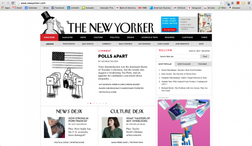
A prime example of a website using great typography is that of The New Yorker, which sports web typography that is beautiful, neat, and recognized nationally.
 why is it cool?
Because typography includes the family, style, and size of a font, it can make an entity’s brand easily recognizable upon first glance. It also gives the website an organized and neat feel.
Typography allows us to create a simple design trend that also leads readers across the website. In the case of The New Yorker, the website isn’t cluttered — it’s neat, clean, and has enough information to help us understand about its contents.
As we read through the first page, the large typography stands out so we can quickly figure out where we need to go, whether it’s the News Desk, Culture Desk, or some welcome items.
trend #8: overlay dropdowns
Overlay dropdowns are a form of dropdown menus that lay directly over the content on your website. That means when you click on an option in a website’s navigation, there are other options that pop up below your menu without taking you to a different page.
why is it cool?
This technique is really valuable for companies that want to fit additional links on the homepage without over crowding the page with text. When you select anything on the overlay dropdowns, you’re still able to view the rest of the page and see other content.
Businesses building sites for responsive layouts prefer this type of dropdown since it lets them maximize the real estate on mobile devices and tablets as well.
[via HubSpot]

