It just dawned on us that we don’t always have to write about stuff we like. Sometimes, we have strong opinions on what we don’t like. And rarely, do we come across something where we cannot decide. And this time around, that’s what we’ve chosen to share with you, the undecided.
The artist that sparked this contribution is Dorota Pankowska, aka Dori the Giant.
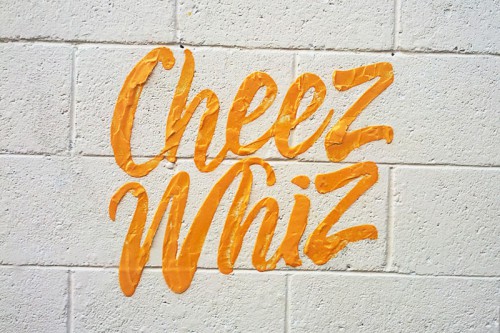
At 24 years old, the photographer by trade has taken to the streets of Brampton, Ontario with a quirky and delightful street art series she calls PRO BONO PROMO. Armed with bottles of ketchup, mayonnaise, peanut butter, and bright orange processed cheese, Pankowska, takes household brands and stencils their logos using the product itself. She claims to be “poking fun at the fact that this almost looks like free advertising for the companies – with free samples included!”
And although we’re not sure if we get the joke, especially since these major corporate brands already monopolize our shopping aisles, her tongue and cheek approach to free advertising for them, somehow still makes us smile.
But why? In a time where everything artisanal and locally-sourced is supposed to be king, it’s hard to admit how warm and fuzzy certain junk foods can make us feel. The funny thing is, the food itself doesn’t make you feel good. It’s the memories connected to the brand that somehow overshadow the preservative-filled hangover. And maybe that’s how Pankowska’s pieces are speaking to us.
Or is it that we also use food as an inspiration, a medium?
From yarnbombing, zip tie installs, and space invader style mosaics, graffiti has come to encompass a plethora of materials. So the introduction of food is not so out-of-left-field… but in our minds, pretty brilliant.
“I love all the street art that I see every time I visit Toronto, and I wanted to do something like that in Brampton, which doesn’t have a big art scene. When I was brainstorming with my friend, I thought about expressing my love for Nutella by putting the logo around the city, at which point I asked myself, Why not actually make it out of the stuff?” – Pankowska via Fast Company
Her meticulously curated pieces, found on surfaces chosen for how their texture or color might contrast with the product itself, pushed us to re-think our reaction to her series. A white wall of mortared cinder blocks as relief for fluorescent orange Cheez-Whiz goop, is this art? Why can’t we look away?!
In the end, we leave you to make up your own mind. At least if you don’t like it, her particular brand of tagging is ephemeral and washes right off.
[via design milk]